
7 AI Website Examples Built in 2026: A Deep Dive
AI website examples have moved from novelty to infrastructure. Pew Research Center found that 93% of respondents visited at least one page with an AI-related term in a month, which tells you AI language is now woven into ordinary browsing, not parked on specialist sites (Pew Research Center). The key question for teams isn't whether AI appears on the web, it's how to tell whether a site is AI-native, AI-augmented, or just dressed up with AI branding after the fact.
This guide takes an evidence-first approach. Instead of another inspiration gallery, it looks at the tools and collections that reveal stack fingerprints, builder artifacts, and launch patterns behind real sites. That matters because modern AI pages are often blends of human and machine work, and the line between generator output and hand-edited production is getting blurrier, not clearer (Ahrefs-based analysis summarized by Stacc). For a reference set of curated examples, see see SupportGPT's curated examples.
Table of Contents
- 2. Framer Gallery, AI category
- 2. Framer Gallery, AI category
- 3. Bolt.new, Gallery
- 4. Lovable, Website and App Templates
- 6. Wix, Explore Websites and Wix Harmony AI creation
- 6. Wix, Explore Websites and Wix Harmony AI creation
- 7. Squarespace, AI Website Examples
- 7 AI Website Examples Compared
- Key Takeaways, Building with AI in 2026
2. Framer Gallery, AI category
Framer's AI category is a useful first-party benchmark because it shows live sites built with Framer's AI-assisted workflow, not static mockups. The gallery matters because the output stays consistent enough for comparison, while still varying enough to show how teams use AI for layout, copy, and section generation. Each entry links to the live site, so the collection reads more like production evidence than a mood board. Analysts can review the gallery itself and then cross-check the same examples with the Framer AI examples page to compare visual output with detection results.
The stack signal is usually easy to read. Framer's modern output often resembles a React and Next.js style environment, which makes the gallery a solid reference for teams studying how AI-assisted structure turns into a polished publishing workflow. That matters because it gives analysts a stable baseline. If a site matches the gallery visually but AI Website Detector identifies a different builder or a custom artifact trail, the resemblance is likely stylistic rather than infrastructural. A live example page also helps separate production work from curated concept art.
For teams evaluating AI website examples, cross-reference these with an AI Visibility Checker tool to see how detection fits into broader research. The best use case is comparison. Framer's collection shows how AI can speed up structure without flattening the final design, and the detector helps show whether the site was generated natively, assembled with AI assistance, or finished in a more manual workflow.
2. Framer Gallery, AI category
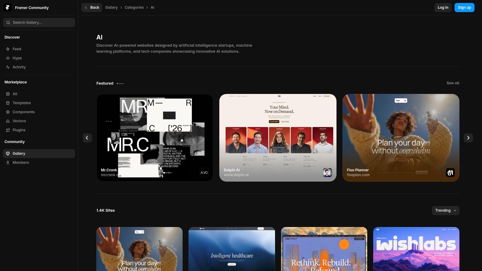
Framer's AI category is a strong first-party benchmark because it shows live sites built with Framer's AI-assisted workflow rather than static mockups. The gallery is useful precisely because the output is consistent enough to compare across examples, but diverse enough to show how teams use AI for layout, copy, and section generation. You can inspect the live site from each entry, which makes the collection more than a mood board and closer to a field sample of production Framer work (Framer gallery AI category).
The stack signal here is fairly readable. Framer's modern output tends to look like a React and Next.js style environment, so the gallery is a good reference for teams trying to understand how AI-assisted structure translates into a polished publishing workflow. That matters for analysts because it gives you a stable baseline, if a site visually matches the gallery but the detector finds a different builder or a custom artifact trail, the resemblance is probably stylistic rather than infrastructural. A live example page also helps separate true production work from curated concept art.
The best use case is comparison. Framer's collection shows how AI can speed up structure without flattening the final design language into something generic, especially when teams keep the typography, spacing, and motion system consistent. At the same time, it's still a Framer-shaped sample set, so the gallery naturally favors one visual grammar over the full market. That bias is useful as long as you treat it as a lens, not the whole market.
AI Website Detector's Framer examples are the right companion when you want to check whether a showcased page is merely Framer-built or AI-assisted in its structure.
The strongest value of a builder gallery is not inspiration alone, it's calibration. You start to recognize what a platform's default output looks like before you judge whether a rival site is actually distinctive.
Why Framer stands out in practice
Framer's AI category is more credible than many inspiration pages because it links to live sites, not just polished screenshots. That makes it easier to inspect motion, responsiveness, and section logic directly. For teams evaluating AI website examples, that kind of live evidence is what turns design browsing into stack research.
3. Bolt.new, Gallery

Bolt's official gallery is one of the clearest looks at prompt-to-app generation in public. The examples range from landing pages to simple web apps, which makes the gallery valuable for seeing what fully AI-generated front ends look like when they are deployed. Because the cards often link to live demos or repository snippets, the collection is better for forensic review than most showcase pages, especially if you want to compare prompt fidelity against the shipped result (Bolt.new gallery).
That makes Bolt especially useful for a different kind of question, not “does this look good?” but “how much of the final structure came from the prompt?” In practice, the gallery shows the strengths and limits of rapid generation. The best examples translate natural language into coherent component structure quickly, while the weaker ones still feel like MVPs rather than finished marketing sites. That's not a flaw, it's the signal. A polished visual layer doesn't always mean the underlying build is mature.
AI Website Detector's Bolt examples help confirm whether a live site is carrying Bolt artifacts or merely borrowing the same modern look. That distinction matters because prompt-driven sites can leave enough code residue to be detectable even after the visible design has been cleaned up.
The analyst takeaway is simple. Bolt is most useful when you want to study the boundary between generation and deployment. It highlights how quickly a site can move from idea to hosted output, but it also reveals how uneven the finishing layer can be once teams move beyond the initial prompt. If Framer's gallery feels like a polished showroom, Bolt's feels like a working lab.
4. Lovable, Website and App Templates
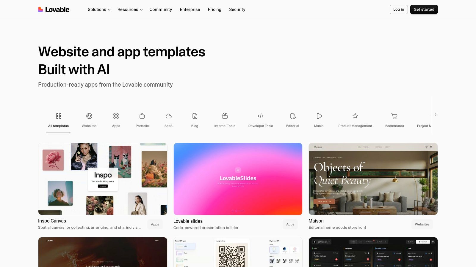
Lovable's templates are interesting because they sit closer to production polish than many AI-generated demos. The collection covers everything from services and portfolios to weddings, and the consistent use of React and Tailwind makes the code patterns easier to read than a fragmented gallery of unrelated stacks (Lovable templates). For an analyst, that consistency is useful, because repeated UI motifs are easier to spot when you're comparing templates against live brands or competitor pages.
The best part is that Lovable doesn't hide the fact that many outputs are template-like. This helps with evidence-based analysis, because you can separate a highly refined starter from a fully custom build. If a site looks finished but the detector points to Lovable-style artifacts or a matching structure, you know you're looking at AI-augmented development rather than a hand-authored design from scratch. AI Website Detector's Lovable examples are the clearest way to check that relationship on a live domain.
The templates also show how AI-assisted tools are changing expectations around design finish. Many of the outputs feel more complete than the typical auto-generated landing page, which is why Lovable is a good reference when you want to understand the upper end of AI-augmented development. Still, the limitation is obvious. A curated template library is not the same thing as a broad sample of third-party businesses, so you should treat it as evidence of the tool's design language, not as proof of how the broader market behaves.
Practical rule: when a template library produces repeated spacing, component shapes, and section rhythm across unrelated verticals, you're usually seeing tool language, not brand-specific strategy.
That makes Lovable especially relevant for teams comparing “AI-built” claims with actual implementation. The page can look premium, but premium doesn't automatically mean bespoke. The detector earns its keep here because it shows whether the visible finish came from a quick AI workflow or a deeper custom production process.
6. Wix, Explore Websites and Wix Harmony AI creation
Wix's Explore hub is a large, curated showcase of live sites across many verticals, and that scale makes it useful for benchmarking real production design choices (Wix Explore Websites). Because the page mixes classic Wix Editor and Studio outputs with AI-assisted creation tools, it gives a wider view of how AI is being folded into mainstream site building rather than treated as a separate category. The result is a messy but useful sample set, especially if you want to compare visual polish across industries and separate platform style from custom brand work.
The attribution problem is the important part. Not every site in the showcase was necessarily generated with AI, so the gallery is stronger for inspiration and benchmarking than for proving AI origin. That limit matches broader browsing data showing AI references are now widespread across mainstream pages, which makes surface cues less reliable on their own. When you pair the showcase with AI Website Detector's Wix examples, you can separate the look of a Wix site from evidence that it was AI-assisted.
That distinction matters more with mainstream builders. Wix is a platform where AI can shape early drafts, refine layouts, or speed up content assembly, but the finished site may still look like a standard Wix build. AI Website Detector's 10Web examples show the same principle from a different angle, the visible finish alone rarely proves how much AI was involved. The useful question is not whether the page looks polished, but whether the stack and structure point to native generation, AI-assisted editing, or a conventional build with a few automated shortcuts.
6. Wix, Explore Websites and Wix Harmony AI creation
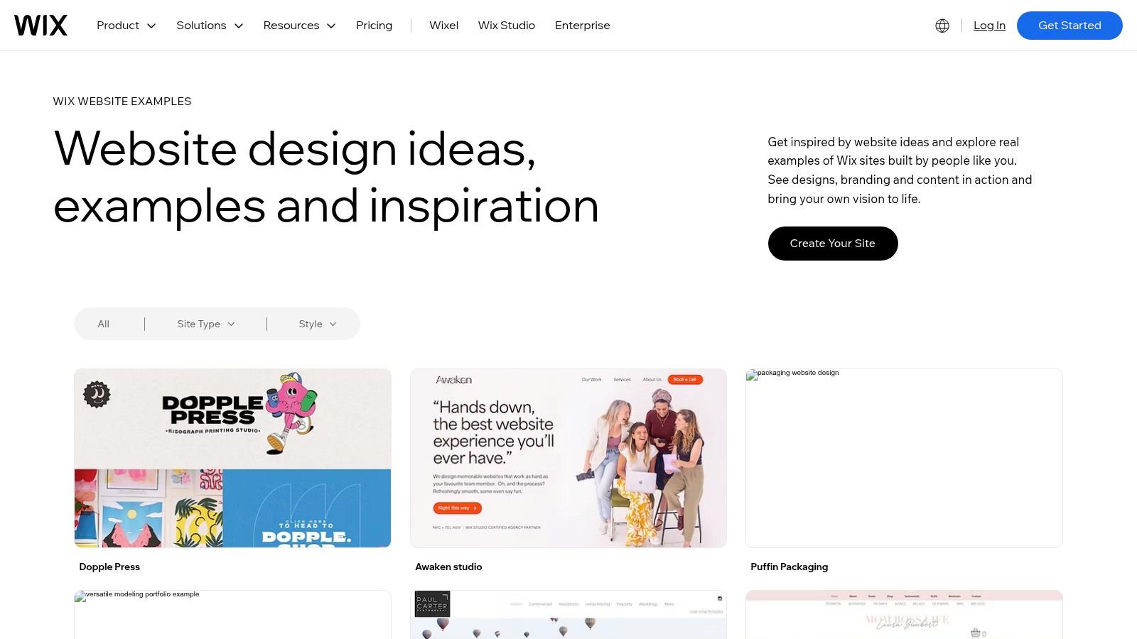
Wix's Explore hub is a large, curated showcase of live sites across many verticals, and that scale makes it useful for benchmarking real production design choices (Wix Explore Websites). Because the page mixes classic Wix Editor and Studio outputs with AI-assisted creation tools, it gives you a broader sense of how AI is being folded into mainstream site building rather than treated as a separate product category. The result is a messy but valuable sample set, especially when you want to compare visual polish across industries.
The key analyst caveat is attribution. Not every site in the showcase was necessarily generated with AI, so the gallery is more useful for inspiration and benchmarking than for proving AI origin. That limitation aligns with the broader market, where AI influence is often subtle and embedded in workflow rather than declared on the homepage. When you pair the showcase with AI Website Detector's Wix examples, you can separate the look of a Wix site from evidence that it was AI-assisted.
That distinction becomes more important when you're studying mainstream builders. Wix is not just an AI tool, it's a platform where AI features coexist with traditional editing. That means a visually strong site might have been assembled through classic components, generated content, or a mix of both. For analysts, the interesting part is that the same finished site can emerge from very different build paths.
This is also where the broader browsing data from Pew matters. AI references are already widespread across mainstream shopping and chatbot pages, so seeing AI woven into a large commercial builder like Wix fits the larger pattern of AI becoming a recurring interface element rather than a niche feature (Pew Research Center). The signal is not only in the site, it's in how normal that AI layer now feels.
7. Squarespace, AI Website Examples
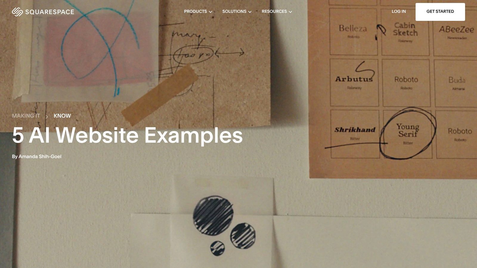
Squarespace's editorial roundup is less of a gallery and more of a guided interpretation of what AI-assisted websites can look like when presentation matters as much as infrastructure (Squarespace AI website examples). That makes it especially useful for nontechnical teams, because the article translates examples into layout, imagery, and storytelling decisions instead of just showcasing the finished result. It's not a stack audit, but it is a practical window into how a mature platform frames AI-assisted design for real users.
The strongest aspect here is the bridge between inspiration and execution. Squarespace ties the examples to its Blueprint AI builder and template ecosystem, which helps readers connect a visual pattern to a concrete build path. That's helpful in a market where many example lists confuse style with construction, because the same elegant page can come from very different implementation choices. AI Website Detector's Squarespace examples help close that gap by showing whether a given site is just Squarespace-branded or using an AI-assisted workflow.
This roundup also reinforces a broader pattern seen across the other examples. Good AI website examples rarely rely on a single trick. They combine clean hierarchy, sharp imagery, and a clear brand story, then use AI where it shortens the path from concept to publish. That combination matters more than whether the page is “AI-looking,” because a site can feel modern without revealing much about how it was built.
For analyst work, Squarespace is useful as a reminder that editorial curation and technical detection solve different problems. One tells you what the platform thinks is worth emulating. The other tells you what the site likely is under the hood. You need both if you want to separate inspiration from evidence.
7 AI Website Examples Compared
| Example | Implementation Complexity 🔄 | Resource Requirements ⚡ | Expected Outcomes / Quality 📊⭐ | Ideal Use Cases 💡 | Key Advantages ⭐ |
|---|---|---|---|---|---|
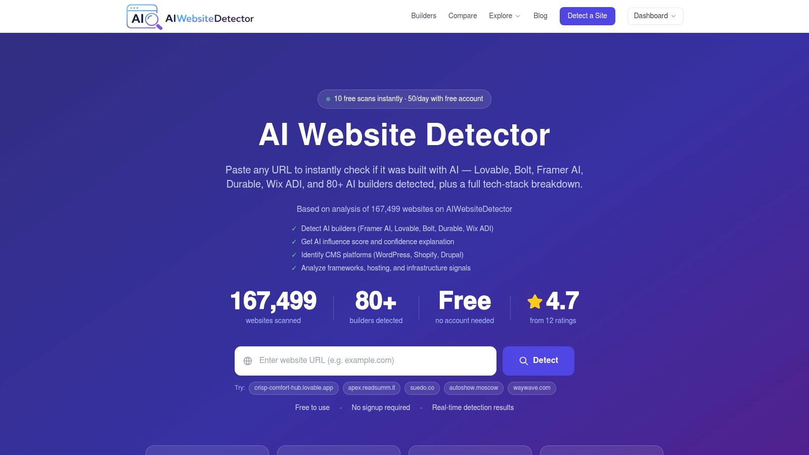
| AI Website Detector | Low 🔄 (paste URL → instant scan) | Low–Moderate ⚡ (generous free tier; API from €12/mo) | High 📊⭐⭐⭐⭐ (85–99% on clear fingerprints; signal-level evidence) | Tech validation, vendor due diligence, competitor & market research | Transparent, evidence-led detections; broad coverage (80+ builders); API & saved results |
| Framer Gallery, AI category | Very Low 🔄 (browse curated examples) | Minimal ⚡ (web access) | High 📊⭐⭐⭐ (excellent design + motion; Framer-specific) | Design inspiration, visual/motion benchmarking | First‑party curated gallery; live site links; consistent modern stack |
| Bolt.new, Gallery | Low 🔄 (view demos & repos) | Minimal ⚡ (web access; demo repos) | Medium 📊⭐⭐ (shows prompt→UI fidelity; variable polish) | Prompt engineering, rapid prototyping, prompt-to-app comparisons | End-to-end generation examples; deployable demos and repo snippets |
| Lovable, Templates | Low–Medium 🔄 (templates → refine for production) | Moderate ⚡ (templates + minor dev work) | High 📊⭐⭐⭐ (near-production finish; consistent React/Tailwind) | AI‑augmented development, template reuse, studying higher-finish outputs | Production-ready templates; consistent code patterns for analysis |
| 10Web, Examples (WordPress) | Low–Medium 🔄 (CMS context & live sites) | Moderate ⚡ (WordPress themes/plugins & hosting) | Medium‑High 📊⭐⭐⭐ (real SMB sites; production/performance context) | Examining AI within WordPress, SMB site examples, performance checks | Real customer sites; shows WordPress-native outputs and integrations |
| Wix, Explore + Harmony AI | Very Low 🔄 (large curated showcase) | Minimal–Moderate ⚡ (web access; Wix tools to recreate) | Medium‑High 📊⭐⭐⭐ (high volume & quality; mixed AI attribution) | Design/UX benchmarking, seeing AI in mainstream workflows | Large, cross-vertical samples; demonstrates AI integration in a mainstream builder |
| Squarespace, “AI Website Examples” | Low 🔄 (editorial roundup + examples) | Minimal ⚡ (article + templates) | Medium 📊⭐⭐ (aesthetic-focused; fewer examples) | Nontechnical teams seeking actionable inspiration and build guidance | Editorial context + practical takeaways; strong design guidance |
Key Takeaways, Building with AI in 2026
These AI website examples show a market that's past the experimental phase. In the strongest cases, AI is no longer the entire product story, it's part of a broader workflow that includes templates, content generation, component assembly, and post-generation editing. That lines up with the wider content environment too, since a 2026 summary of Ahrefs-based research reported that 74.2% of newly created web pages contained some AI-generated content, and only 2.5% were pure AI output, with the rest described as human-AI blends (Stacc summary of Ahrefs analysis). The practical conclusion is that most modern sites are not machine-made or human-made in a clean binary. They're mixed systems.
That also explains why visual judgment alone is weak evidence. A sleek homepage can come from Framer, Bolt, Lovable, 10Web, Wix, or Squarespace, but each platform leaves different fingerprints in markup, scripts, and assets. Independent commentary on AI-native sites says the strongest examples don't just look polished, they tend to show the actual product, surface model or architecture details, and publish limits and security context up front (NxCode analysis). Those signals matter because they make a site easier to trust, not just easier to admire.
For teams choosing a builder, the decision is workflow fit. Framer and Squarespace lean toward polished publishing experiences. Bolt emphasizes prompt-to-app speed. Lovable sits in the middle with cleaner AI-augmented development patterns. 10Web and Wix show how AI can be embedded inside mainstream ecosystems rather than introduced as a separate tool. The right choice depends on whether you care more about speed, code control, CMS familiarity, or the ability to verify what happened after launch.
If you're evaluating a competitor, an agency portfolio, or a vendor claim, don't stop at the homepage. Scan the URL, inspect the signals, and compare the visible design with the underlying stack. That's the only reliable way to tell whether you're looking at native AI generation, AI-assisted production, or a conventional site that borrowed the aesthetic.
A CTA for AI Website Detector.